User Experience Design (Part 1 of 2)
One of my most embarrassing moments in design school happened in a class called Foundation 4D, where students were supposed to be taught the art of storytelling and communication. In one particular project that was graciously entitled “anything” by our wacky professor, we had to share our ideas and concepts with everyone in front of the class.
During my turn, I said a lot of words about essentially nothing as I tried to make myself sound smart. After a good amount of time, I recall being frozen at my feet and fumbling for words when my professor asked me a very simple and reasonable question:
“Who is your target audience?”
I had no answer.
Usability Week
I dipped my toes into the rapids of User Experience Design (UXD) at Usability Week Las Vegas 2014, organized by the Nielsen Norman Group. It ended up being a dive into the depths, but I appreciated the intensity and volume of content the lecturers went through in just 5 days. The well-paced schedule allowed me to immerse myself in all things UX, gaining a broad perspective of interaction design; a keen eye and sensitivity for details in UX methodology.
These were the courses that I took:
- Complex Applications & Websites
- Usability Testing
- Visual Design for Mobile & Tablet
- Intranet Trends & Best Practices
In this post, I’m going to share with you some key concepts that I found extremely helpful for wrapping my head around UXD. So sit tight and grab a cup of coffee!
1. The UX Stack

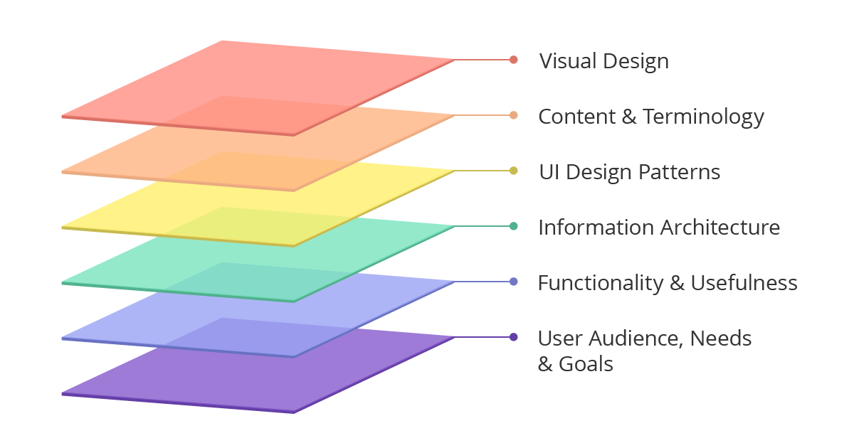
The many layers of UX practice
This is a term introduced by Lynn Pausic and Dr. John Morkes, the fine folks from Expero Inc. Its concept is similar to software stacks as understood in the computing world. If you have tried to pick up UX practice via a combination of learning from the internet and attending conferences or courses, you may have come across these terms:
Observation, User Interviews, Surveys, Focus Groups, Contextual Inquiries, Competitive Analysis, Analyst Reports, User Experience Metrics, Stakeholder Interviews/Surveys, Investigating Domain, Epics, User Personas, Use Cases, User Stories, Storyboarding, Usability Testing, Card Sorting…
That’s a crazy long list; and it goes on! I was pretty much overwhelmed at first, but categorizing all these activities under a larger conceptual model gives you a bird’s eye view of the UX process, which can be pretty involved and extensive. It is extremely helpful if you need to plan a UX schedule that meshes well with that of your software engineering team, and helps team members who are new to UX get up to speed quickly.

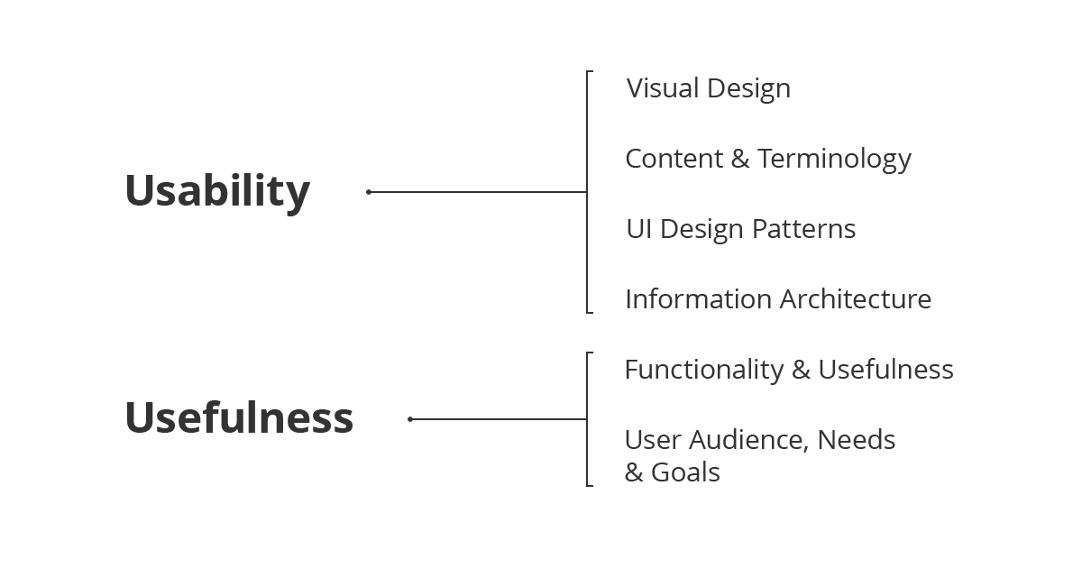
Usability and Usefulness stack
You can even split the stack further into two broad categories. This will come in useful as you progress through the UX process and gather large amounts of data. Design is iterative by nature, and you will not find yourself moving through the layers from the bottom to the top in a linear manner. In fact, you will find yourself jumping back and forth between the layers quite a bit as you sieve through notes from your interviews and observations.
This conceptual model has been the bread and butter of my process ever since I brought it back to my organization (which is new to UX). Currently, our User-Centred Design (UCD) team operates in a distributed organizational structure, where usability professionals are assigned to work on separate project teams and report to a project manager.
Which also means that I have to get the project team’s buy-in—and that can be a really difficult and sticky thing to do. Instead of trying to explain the purpose and details of methodology, I realized that introducing them from a top-down perspective using the UX Stack minimized friction, reduced resistance and greatly eased the process of alignment.
If you are responsible for propagating UX knowledge throughout your organization as well, do consider this approach!
2. User Research
User research is the foundation for every individual layer in the UX Stack. Every design decision should be undergirded by the findings and insights you get, no matter what research method you employ. The moment you find yourself designing functionality based on assumptions that are not tested or verified i.e. no backing from research data, you might already be on the wrong track.
It is easy for UX practitioners to be caught up in methodology, so much so that they lose sight of the bigger picture. This is where the stack comes in useful. At the end of every user engagement, take time to sit back and analyze your findings. Sort them into the appropriate categories so that you can have a better idea of what information you are lacking. Then, modify and tweak your plan and repeat the cycle.
Remember, the purpose of doing user research is to understand your audience in a particular context. Don’t lose that context!
3. Prototyping

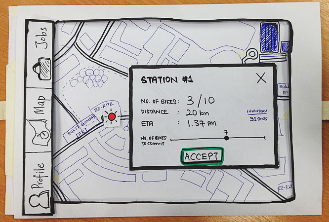
Paper prototyping - get comfortable with sketching!
If you treat wireframes and prototypes as mere deliverables, you are missing out on the real power of these tools. This is especially true if you find yourself spending time beautifying them and making sure that the stars align, just so that you can have an answer for your client when he asks, “So what have you been doing since the last time we met?”.
Paper prototypes are my personal favorite; they are extremely effective in galvanizing people to have a stake in the UX process. I provide markers and pens for my test participants, and make it a point to tell them that they can doodle on the prototypes if they want to (after going through all the tasks). Letting them alter the prototypes right there and then implicitly tells them that they have the power to change the design; that you value their feedback and this will make your job much more enjoyable.
Paper Prototypes can also make discussions within your UX team more productive. Gather your team huddles around prototypes that you can doodle on. They can be printouts so that you don’t have to draw them all over again. The point is that they provide context for your discussions, just like how having user personas on the walls remind you of the people you’re designing for.
4. Usefulness & Usability

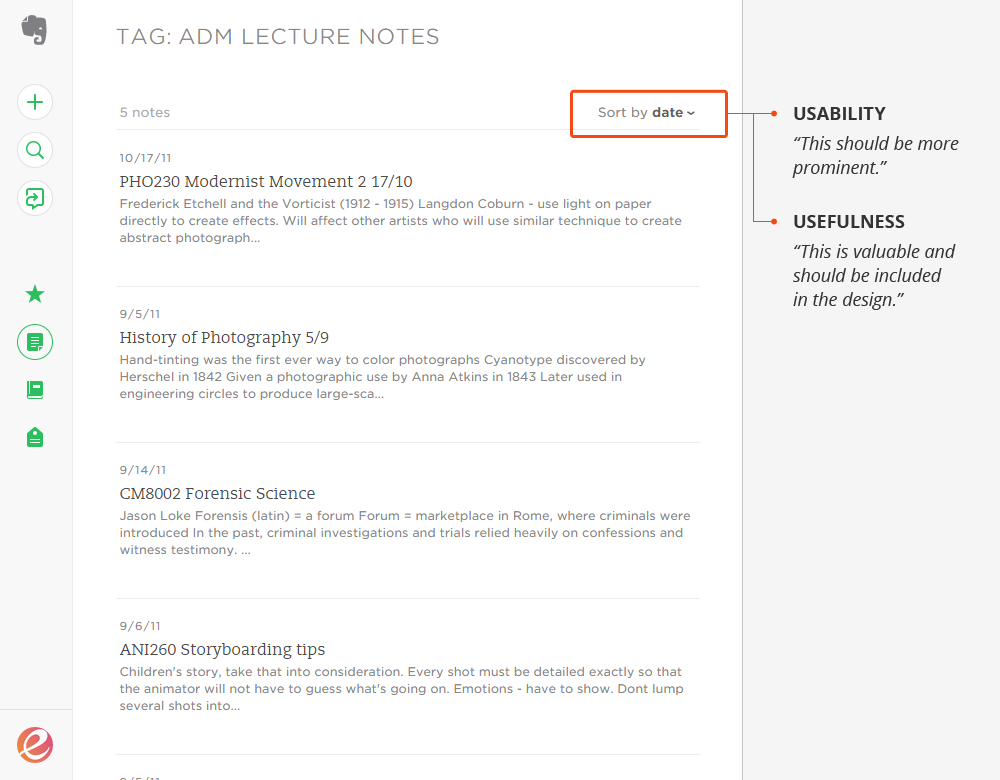
Usefulness and Usability - know the difference.
Earlier on, we explored a little about sorting findings under two broad categories. Sometimes, it’s not that straightforward. For example, a comment from a test participant during a usability testing session like “I can’t figure out how to view detailed information about this product” may mean a few things:
- The button is not prominent enough (usability)
- The UI pattern used is not intuitive (usability)
- Detailed information is more important than say, product reviews (usefulness)
This is where experience and skill comes in. If the test participant in this example skipped reading product reviews and tried to find detailed information straightaway, you have just found a big clue to a potential Usefulness issue. You can either wait and continue to monitor for repeated occurences across other participants, or change up your prototype between sessions to test your assumptions.
What’s next
I hope that this post has given you a clearer understanding of the UX process. Part 2 of this series is already in the works, and I intend to share my opinion on what it takes to be a good UX practitioner. Meanwhile, here are some reading materials that I recommend for further learning: