Rethinking top-level navigation labels
Can you guess what website this is just by looking at these words?
- About us
- Topics
- News
- Events
- Publications & Statistics
- Careers
- Gallery
- Budget 2016

Ministry of Culture, Community and Youth’s top nav bar
Let’s try again.
Can you tell what you can do on this website by looking at these words?
- About us
- Careers
- Media Room
- Circulars
- E-Services
- More
- Feedback
- FAQS
- Sitemap
- Contact Info
- Plans & Maps
- Tools for Professionals
- Tools for the Public

Urban Redevelopment Authority’s top nav bar
Placemaking
As humans, we have a strong desire to make sense of our environment. Whenever we enter into unfamiliar physical spaces, we feel uneasy until we can figure out where things are. Fortunately, it doesn’t take us long as most places are relatively well designed.
Where am I?
If we see a blackboard in a room, it’d be safe to say we’re in a classroom or lecture theatre. If we see a toilet bowl, well, it’s probably a toilet. But if all we can see is a reception counter, we begin to struggle in deciding what the space could be. We quickly realise that we need more hints.
What can I do here?
The design of a physical space—decor, furniture, and layout—tell us where we are and what we can do in a particular space. A high level of specificity means we are less likely to be confused. We wouldn’t think that we could cook up a meal in a toilet. On the other hand, a high level of ambiguity allows us to use the same space for different purposes. A room with only tables and chairs can function as a classroom, office space or even a makeshift marketplace.
Digital Spaces
What is the Internet? It is a virtual space where we are able to navigate and move around in—essentially a flurry of electric signals. We use words like visit, go, return, next and back when we talk about using websites or apps, as if we can physically move inside them.
Most of what we experience in digital media are information environments. Like physical spaces, we approach these environments with similar tendencies—the desire to make sense of our surroundings. We want to know where things are, and we have some idea of where things should be. When these expectations are not met, we get frustrated.
That’s exactly what your top-level navigation labels are supposed to do. They tell your visitors where they are, what they can do, and what they can expect to do.
Not just signposts
But top-level navigation labels do more than aid in wayfinding; they also communicate an identity. When put in the top navigation bar, they are the most visible and most often used parts of a navigation system. By this virtue, they influence our actions or expectations on a website more than we care to admit.

What Starbucks is saying: Drink coffee
Starbucks wants you to think about drinking coffee when you’re at their website. They want you to know that they are responsible, and also tell you a little bit about their rewards program (to make you drink even more coffee). Each time you go to a new page, these five items will be there:
Coffee. Menu. Coffeehouse. Responsibility. Card.
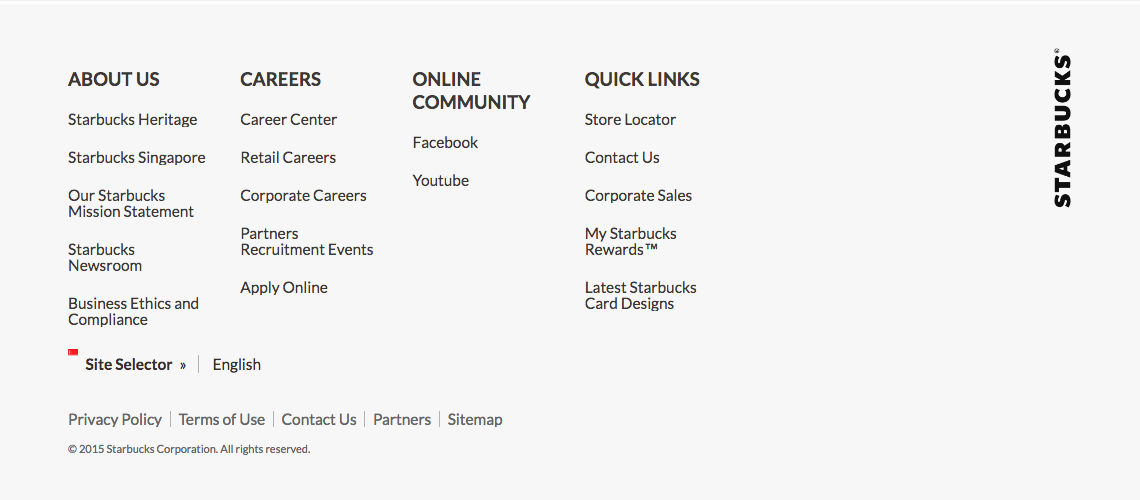
Starbucks actually has a bigger website than what the top navigation bar alone suggests. The designer of their website clearly understands the power of words. These five words are deliberately placed in the top navigation bar, and the rest are placed far down, all the way in the footer.

Starbucks’ navigation system continues in the footer
Modern patterns
Not every top-level label has to go into the top navigation bar. It takes immense courage and willpower to navigate political landscapes, just to come up with navigation bars like these:

What Uber is saying: Ride, drive

What PropertyGuru is saying: Sell, buy, properties

What HipVan is saying: We deal with furniture
Some progressive government agencies in Singapore have also begun to embrace such patterns:

What MOM is saying: Work and employment

What Nparks is saying: Gardens, parks, nature

What OneService is saying: Neighbourhood issues
Moving on
If you are redesigning a website, look at your top-level navigation labels and see if they:
- Tell people where they are
- Tell people what they can do (and expect to do)
- Tell people who you are
But what about my logo?
Don’t assume that your logo tells visitors everything you think it does. It merely tells them that the website belongs to you. Remember, people treat digital spaces like physical spaces. Design your information environment just like you would design a physical space.