Redesigning my website
I launched my first ever personal website in 2014, at a time where responsive web design had already peaked for a while. The outcomes I wanted to achieve then were:
- Ultra-low first paint time
- Usable experience at any screen size thrown at it
- Everything under 50kb over the wire
- Visual style should stay true to my identity
Good but meh
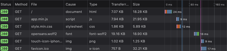
Mission accomplished—less than 40kb over the wire—from a tiny linode instance
Tricks like critical above-the-fold CSS let me squeeze out an extra tiny bit of performance, and serving my logo and icons as <SVG> elements embedded in the HTML document reduced the number of HTTP calls needed. I was willing to trade a tiny hit in document size to reduce multiple round-trips, and this was back when HTTP/2 support was poor. I even chose Georgia for my body typeface, just so I can fetch less files.
When it came to designing its visuals, I used zero accent colors and only allowed myself one font file at most to keep things interesting for me. Fortunately, I could get quite a bit of mileage out of free fonts. Georgia’s pairing with Open Sans gives a soothing contrast, and I relied heavily on a consistent vertical rhythm to imbue some sense of movement in the page. With mostly just words, lines and plenty of white space, I think I managed to put something decent up. In my opinion, it still looks great on a small viewport by today’s standards.
But it also sucked really bad on large screens.
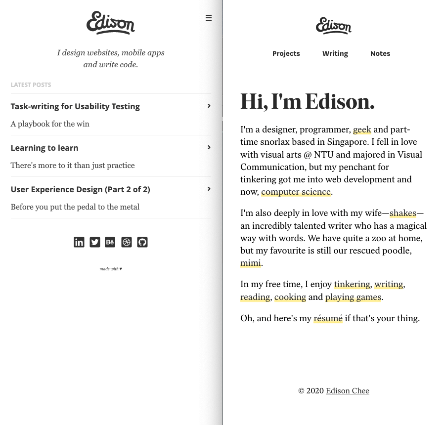
Looks great on mobile
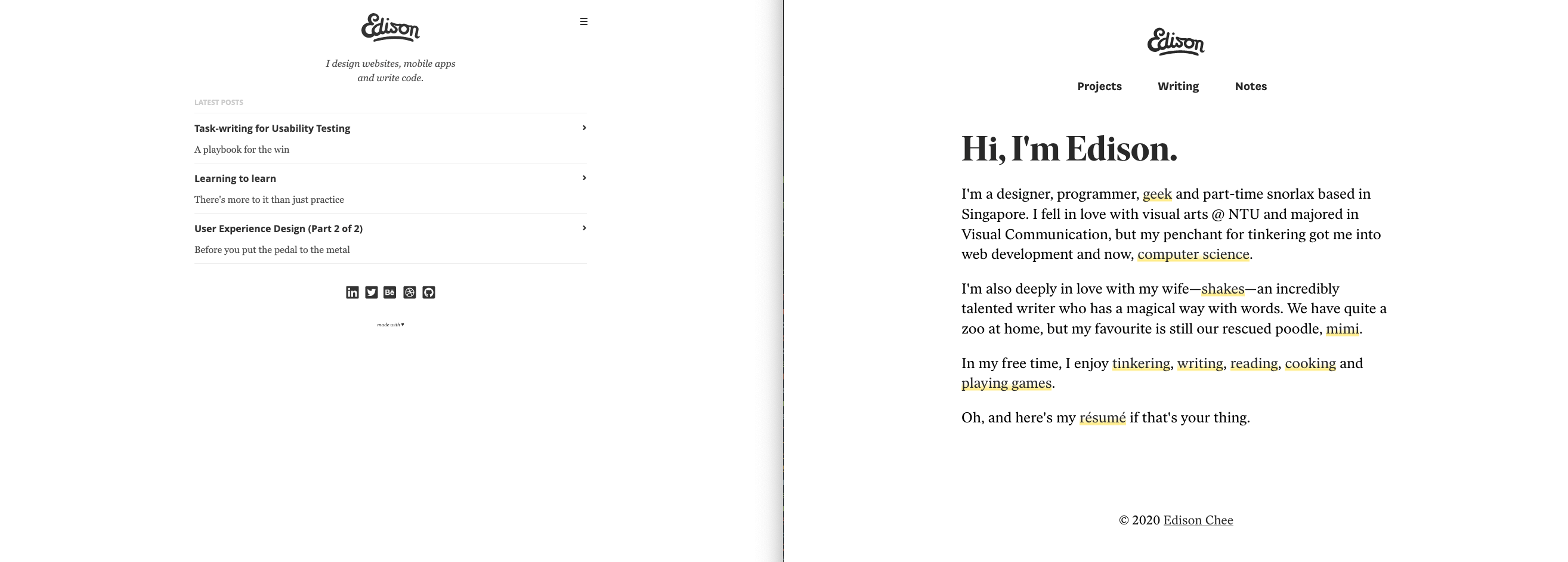
But terrible on larger screens
New considerations
Looking from where I am now in 2020, it’s fugly. I must say that it accurately reflected my identity as a designer fresh out of university—understated expression, lack of confidence, and crisp technical execution that crumbles when stretched in new formats.
There were also a couple of usability issues that stuck out like a sore thumb to me, like small hit targets for icons and blog post links.
More importantly, the visual style no longer fully reflects who I am as a person, both in personal growth and professional development. With all these in mind, I started out my redesign with new considerations:
- A bolder and more confident expression, both graphically and through words
- Responsive design is table stakes now. Take advantage of large screens!
- Good enough performance. As long as visitors don’t feel that it’s slow, who cares how super-optimised it is?
I also decided to show up even more as a person, upfront. My home page is also my about page, and I kinda like the economy of this decision.
My workhorse
Minimal designs are not that difficult to achieve. With proper discipline, shaving things off relentlessly will get you pretty far. But achieving an elegant minimal design is a tad harder.
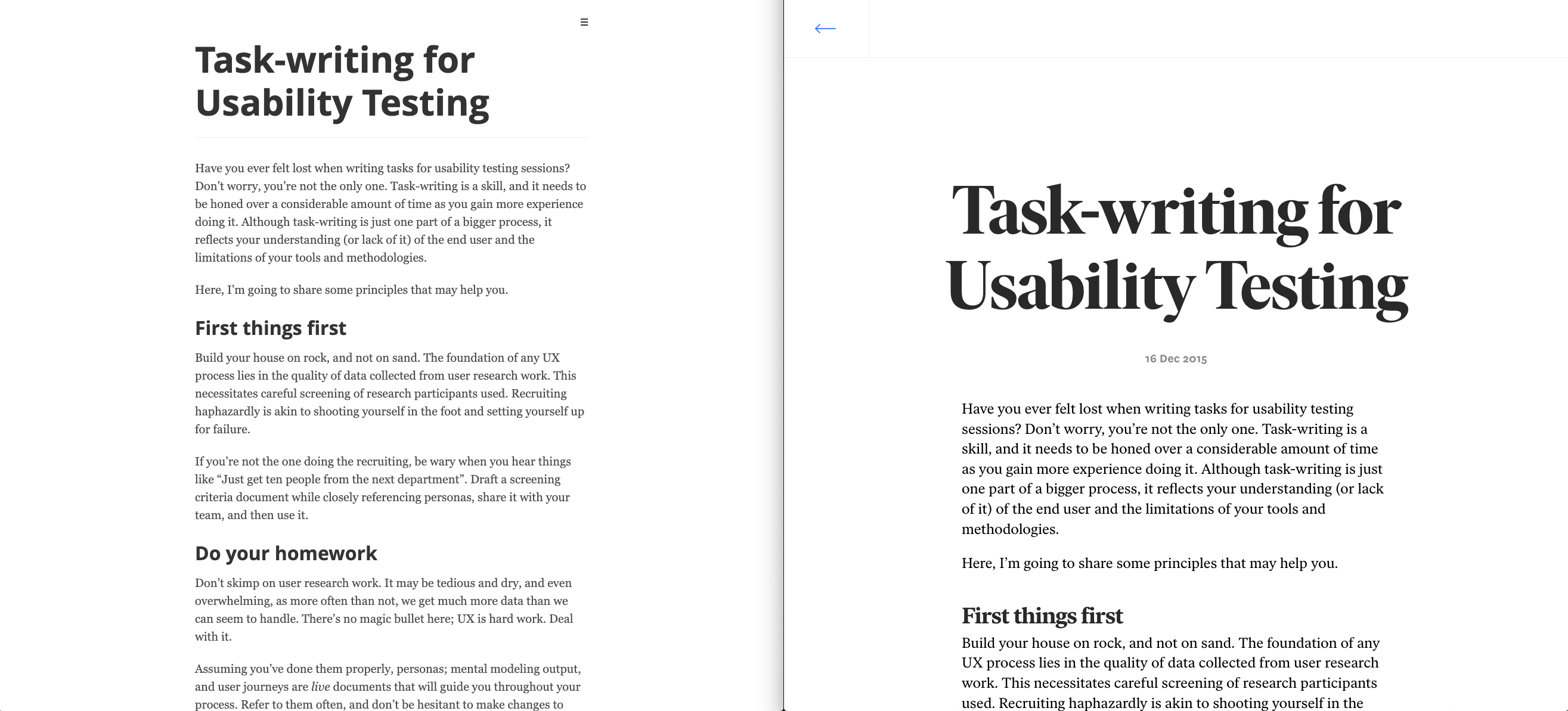
I realised that I needed a workhorse to carry my website, and Ivar from Letters from Sweden fits the bill perfectly. Its display family dances gracefully on the screen when given enough space, and matches perfectly with its regular family for body text. Finally, I paired it with National for UI copy, a stable grotesque font with just a little bit of swash and personality (I particularly enjoy the ‘g’).
Achieving movement with a well-crafted font
Letting it fly on a coloured canvas
A different spirit
When I first started out in my design journey, it was natural to only show work that was done, like Michaelangelo’s David kind of done. That was how I approached my first website, and when it was finished, I felt quite a bit of resistance to shifting things around again.
The difference with marble sculptures and websites is that I’m working with material that’s inherent fluid and volatile. Electrons don’t like staying still.
I was deeply impressed by a Taiwanese B&B’s owner’s obsession with improving his premises up on the Alishan mountain last year. He picked up gardening from scratch so he can beautify his walkways with more flowers. He only just started, which made the previously unsightly mounds of soil out in the frontyard beautiful in my eyes. When we sat down for tea and alcohol at night, he shared further about how he can’t stop thinking about ideas for improving customers’ experiences, such as installing heat regulators inside the room toilets, which was unusual for most B&Bs.
What I took away from this experience, and felt, was that his creation was in motion. It was alive and buzzing. I wanted to emulate that.
One way I’m setting myself up to constant reinvention is using my website as a personal collection of notes. If I’m constantly learning and adding notes, it should have less chances of growing cobwebs again.
If having a room that’s kept clean impacts my self-confidence, I’m guessing that having a well-maintained personal site makes me feel better as well. Let’s see how far this goes.