Elusive UI bugs
Over the weekend I was just trying to catch up on ExileCon 2026, and I ran into an annoying “bug” while searching for a VOD of the event on the Twitch iOS app:
Searching for ‘pathofexile’ on the Twitch iOS App (v31.9)… can you see the problem here?
It might take a couple of loops before you notice the issue, but once you see it you can’t unsee it. I was simply looking for GGG’s official Twitch account ‘pathofexile’. It wasn’t my first time searching for this term, but it was the first time I ran into this issue as a long-time user of the app. The moment I saw the search result I wanted on the page, my thumb was already moving towards it to tap it. And I did, which made me tap on the wrong result because the layout shifted too quickly.
Here’s the problem broken down into stills side-by-side (with timestamps) to visualise it better:
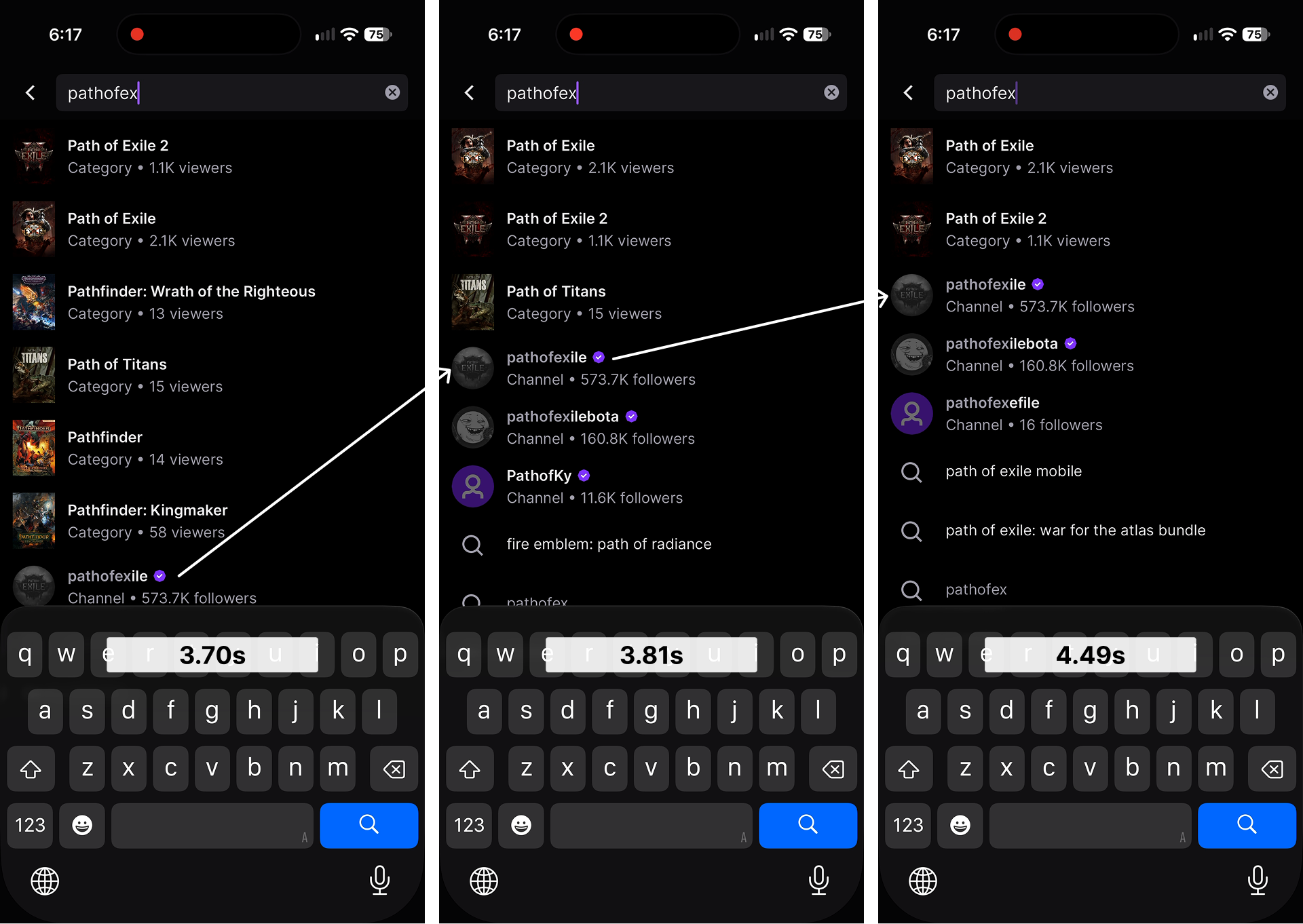
Two layout shifts within a span of 790ms.
I was typing with one hand
The reason why I only encountered this just now after so long is because, well, for some reason I was holding a piece of bread in my left hand. Classic situational disability, but that’s a whole other topic altogether. When I saw the search result I wanted at 3.70s, I committed to tapping it because it’s the closest to my thumb near the keypad. Then the results changed and layout shifted at 3.81s. 110ms is less than half of the typical human reaction time.
Here’s the thing, I swear, I knew I tapped on the wrong result by the time my thumb hit the screen. I just couldn’t react in time because the layout had already shifted twice, which made me more frustrated because it almost felt as if it was my fault for being slow.
What really went wrong?
To be honest, I’m not even sure if anything went wrong from a product designer’s perspective. Is this expected or intended behaviour? Can’t tell. I had put the word ‘bug’ in double quotes in the opening paragraph alluding to this uncertainty. And I’m going to expand on it further.
Odds are that ‘Layout should not shift while user is tapping on a result’ never came up as a requirement from the designer’s POV. Who would have thunk. Hand-offs were static in Figma, and prototypes very likely only covered the happy path. Engineers developed according to ‘spec’ (remember, static screenshots), and are spending their brain power thinking about data structures, handling stale data, API responses, caching, and managing both UI and application state. Finally, let’s assume it went through both automated and manual testing before deploying to prod.
Testing can’t catch it
Automated testing would miss this the same way everyone staring at the mocks on Figma would have—snapshot tests, screenshots, pixel diffing, and whatever, are all static images. Because the Twitch iOS App is native, web-vitals don’t apply here. Even if it did, for a web context, CLS (Cumulative Layout Shift) ignores layout shifts within 500ms of user input.
Okay, there’s E2E testing. But who on earth is simulating different typing speeds? And don’t forget that automated testing produces a huge amount of artifacts. It would take someone with sharp ears and eagle eyes to spot this in a single video recording, out of a mountain of test scripts and scenarios.
Okay okay, what about manual testing? Surely there’s still hope there? If you’ve seen manual QA testers work, you know they’re not typing things slowly, and definitely not with one hand. They’re proficient with two-hand typing on a mobile device, trying their best to clear out a backlog of test scenarios. They’re both fast and accurate, just like automated tests:
Me typing with both hands this time.
Maybe user feedback would save the day?
Okay okay okay, maybe I send in a bug report as a user, assuming I don’t first blame myself for having fat fingers. I type a perfect description with screenshots, recordings, steps to reproduce the problem, platform id, app version, time of day, and moon cycle, just like how everyone does it /s. The report reaches L1 support and gets routed to the dev team.
“Is this even a problem?”. And we’re back to square one.
Stable layouts
Just so I don’t come off as nitpicky, here’s a video of how Apple does it in the App Store for comparison. This is how we know a better experience is possible:
The results appear a tiny bit later, but they remain stable after appearing.
If you look a little bit closer, you’d notice that there was a slight delay after typing the ‘r’ character. A solution could be something like ‘only render when computation is completely done, including resolving async threads’. Unfortunately, this is in the realm of the frontend engineer and is not something intuitive to designers.
I’m guessing what happened in the Twitch app was something to do with async updates, reactive UI or data-binding, where renders happen the moment state changes. That isn’t something inherently bad; some situations call for it. As usual, the context matters.
Test in unusual ways
If you’re reading this as a designer, here’s something fun to try. Be creative and test in ways that engineers and QA testers typically won’t: chaotic, unsystematic, illogical, irrational. Something like drunk user testing1 could work, just make sure people don’t actually get drunk in the office. If you do try a weird way to test, I’d love to hear about it.