Designing a Textual Interface
We released the alpha for an internal productivity tool a month ago — a room-booking chatbot for our humble office at the Sandcrawler.
It was challenging to design a usable interface where we had little control of visual elements. In fact, the interface with a bot is mostly text.
Thankfully, Jakob Nielsen’s seminal article on heuristics for UI design is still applicable today. We used some of these principles to improve the usability of our bot, and in this article we’ll look at how it changed before and after.
First Impressions
When a person initiates a conversation with a chatbot, its first reply should indicate how to further interact with it. This is akin to showing the user where the navigation bar is when a webpage loads. This is where we applied the “Help and documentation” principle.

How to introduce a bot
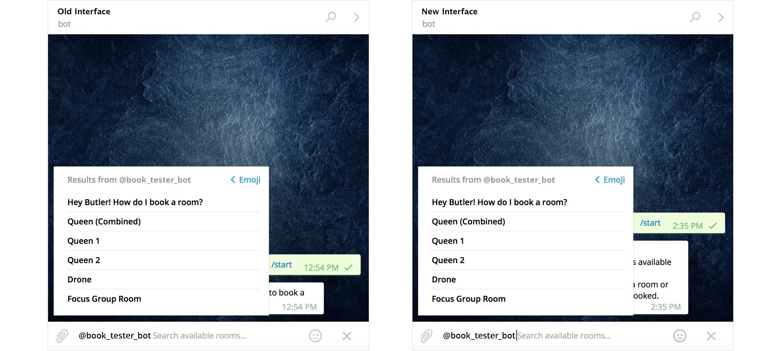
No changes here; showing how room selection pops up when you type the bot’s name
We love Telegram’s inline bot interactions. It takes advantages of the most basic interaction that everyone is familiar with: typing in a chat app.
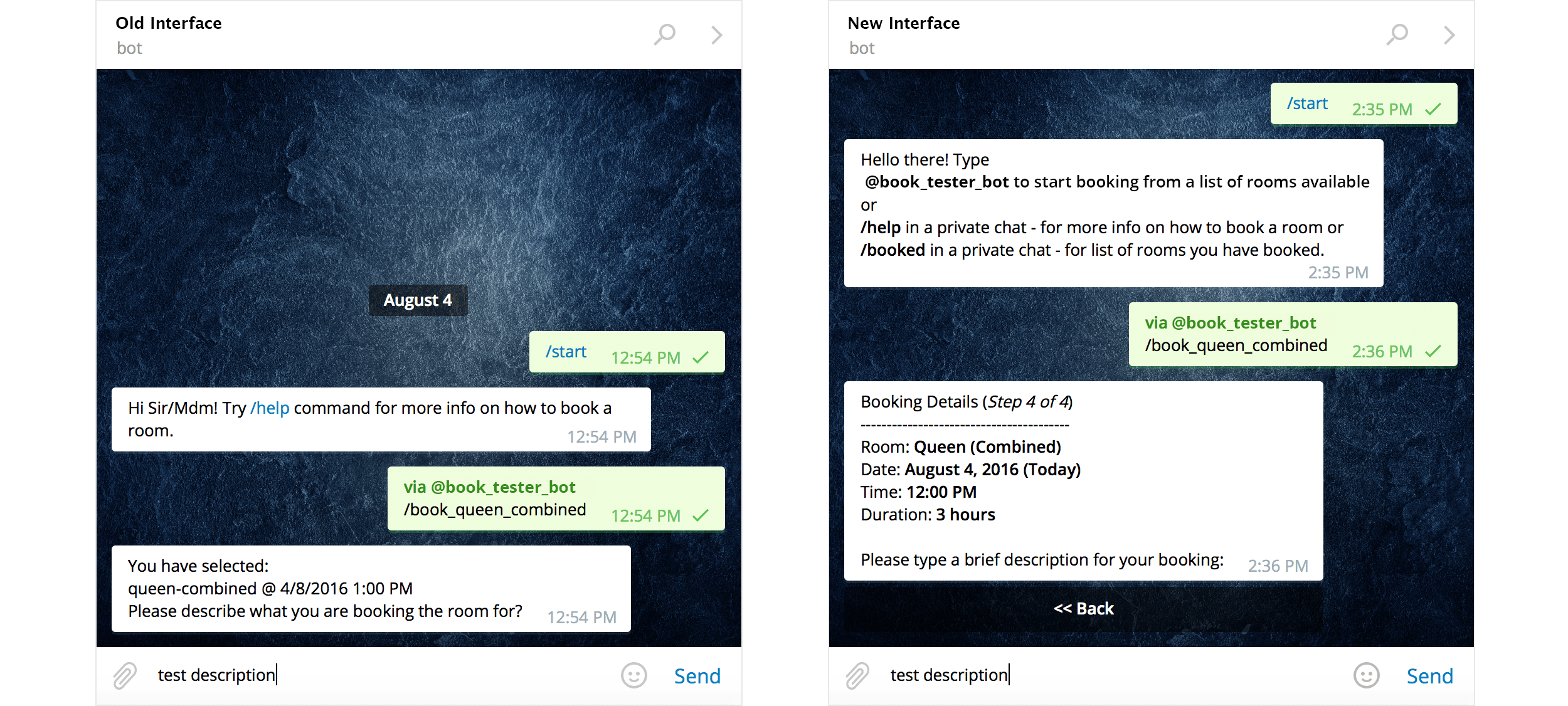
Visibility of System Status
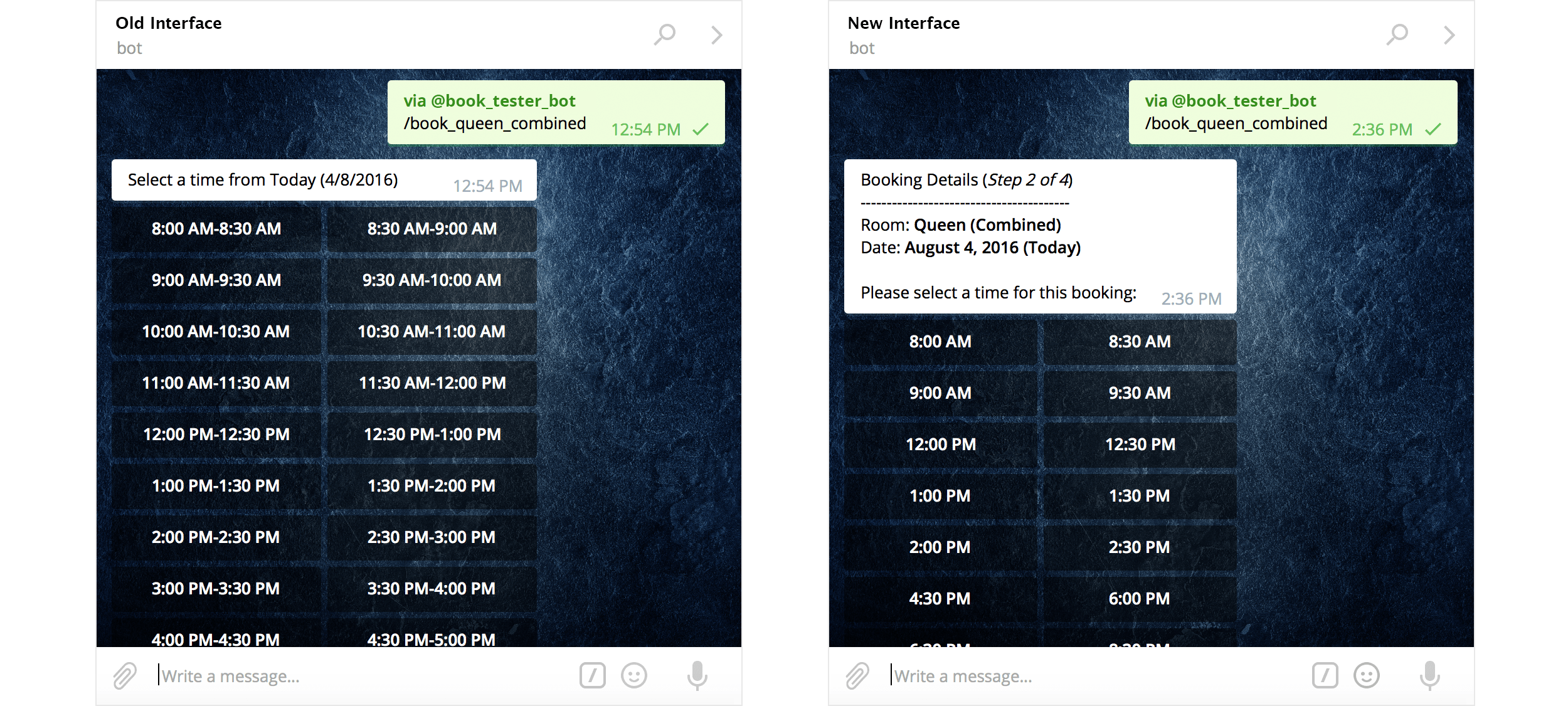
Let users know what’s going on at all times. In our new interface, the words “(Step 1 of 4)” is merely a text form of a familiar UI pattern — the progress bar.
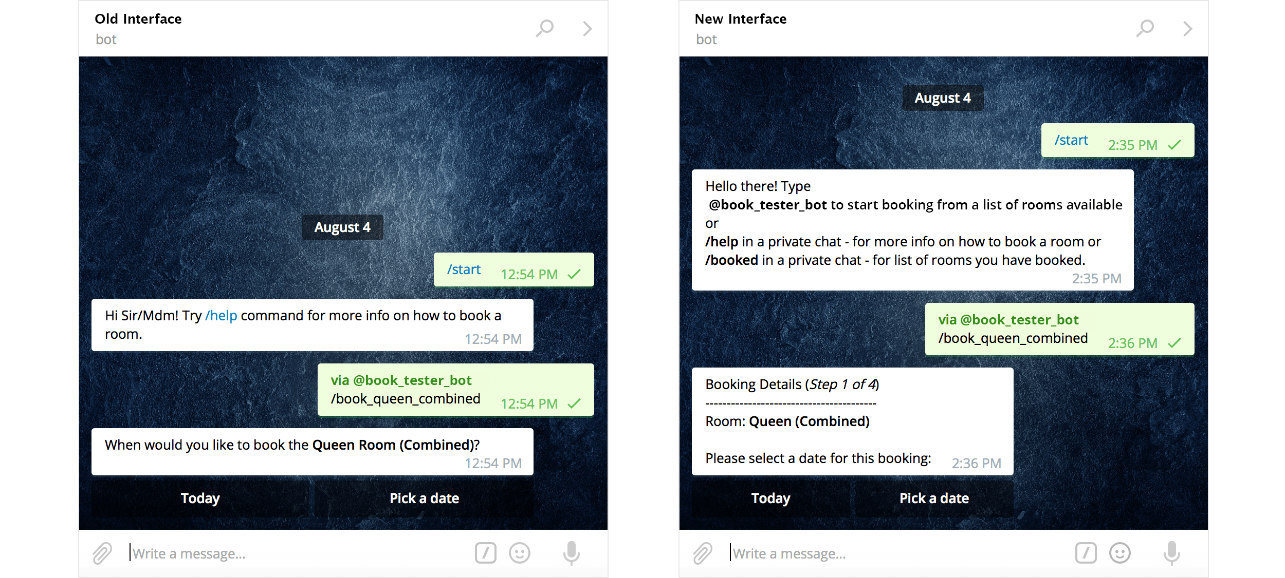
Communicate status
Keep users updated on progress
Consistency and Standards
Consistency is about maintaining patterns. At this point in time, users would have noticed that the header “Booking Details (Step # of 4)” is not going anywhere. This is good. The body of the message is where they can always refer to their past actions. That is good too. The footer of the message is where they can always expect instructions for the next step. Perfect.
This hamburger layout is something most people are familiar with, and you’re unlikely to go wrong with this approach no matter how interface design changes in the future.
User Control and Freedom
Let users undo. We quickly realised that there was no easy way for users to change their selections. Adding in a back button to facilitate this improves usability straightaway. Making provision for error recovery reduces interaction cost, making users feel safer in exploring the interface:
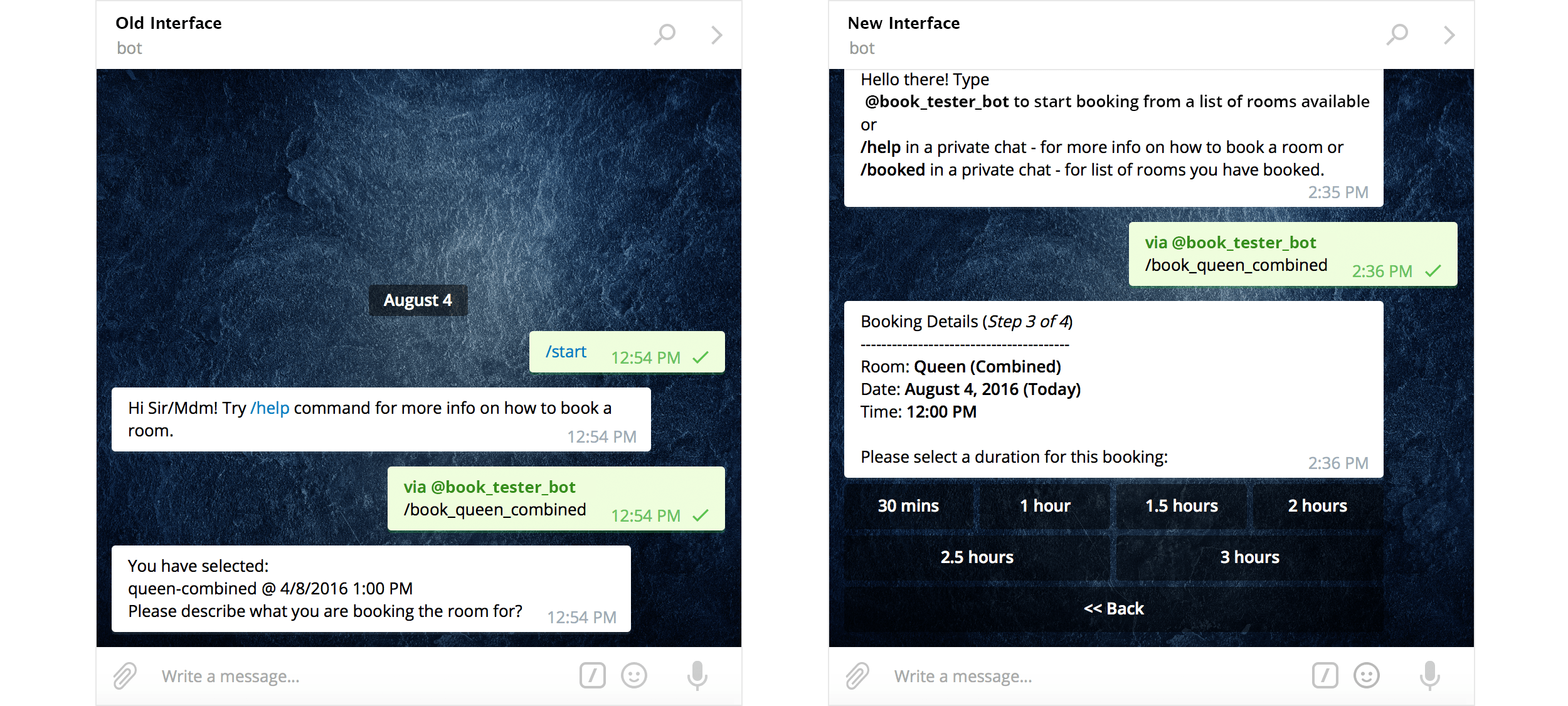
Make provision for error recovery via ‘« Back’ button
Error Prevention
Error prevention is different from error recovery. As the saying goes, prevention is better than cure. Jakob Nielsen suggests presenting opportunities to confirm actions. This means asking the user “Are you sure?” when they make a selection.
We understand that the proper interpretation of this principle is to use such confirmations for destructive or irreversible actions. Even then, we chose not to apply it at the end of the booking workflow.
To complete a booking, users simply have to type a simple description and enter it in. We did away with a confirmation dialogue to not make it any more laborious to make a room booking.
Nonetheless, we are still testing this design decision. If the number of accidental bookings increase, we would consider adding in a confirmation option here.
A clear and consistent UI via messages
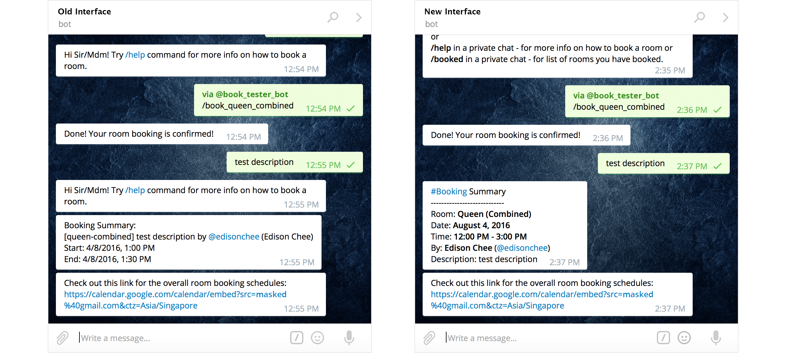
Readable language + clear visual hierarchy makes the bot easier to use
Recognition rather than recall
At the end of the booking flow, we changed the header of the message to “#Booking Summary” to indicate to the user that they have completed their booking. We also stuck to the same layout for the booking details to preserve familiarity.
An improvement here would be appending another message that asks if the user would like to make another booking, or check all existing bookings. This saves him the trouble of typing “/help” or remembering the commands.
Get the basics right
Having a solid grasp of fundamental design principles helped me to tackle challenges in unfamiliar territory. In this case, it was designing a textual interface. In the future, it could be aural, gestural, or a hybrid. Whatever it is, the role of a designer remains integral to building products and services, because at the end of the day, we’re bridging the cognitive gap between the digital and physical world.
An additional benefit to using these principles is sharing my design process with software engineers in a positive way. These principles are tool-agnostic; developers do not have to use Photoshop or Sketch to understand design.
Hope this helps! Reach out to me if you have any thoughts to share. ☺️